21 Living Room Mistakes That Make Spaces Feel Wrong
Your living room can have beautiful furniture and still feel strangely uncomfortable. Living Room Mistakes That Make Your Space Feel Off are often small details that affect the entire room, from furniture proportions and blocked walkways to poor lighting and crowded surfaces.
The good news is that you do not always need new furniture or a complete makeover to improve the space. Sometimes, moving a sofa, changing a rug size, editing your decor, or adjusting the lighting can completely change how the room feels. In my experience, the biggest improvements often come from correcting a few overlooked details rather than buying more things.
In this guide, you’ll discover 21 common decorating mistakes and practical ways to fix them. Each idea is designed to help you create a living room that feels more balanced, comfortable, functional, and visually inviting.
Wrong-Size Furniture
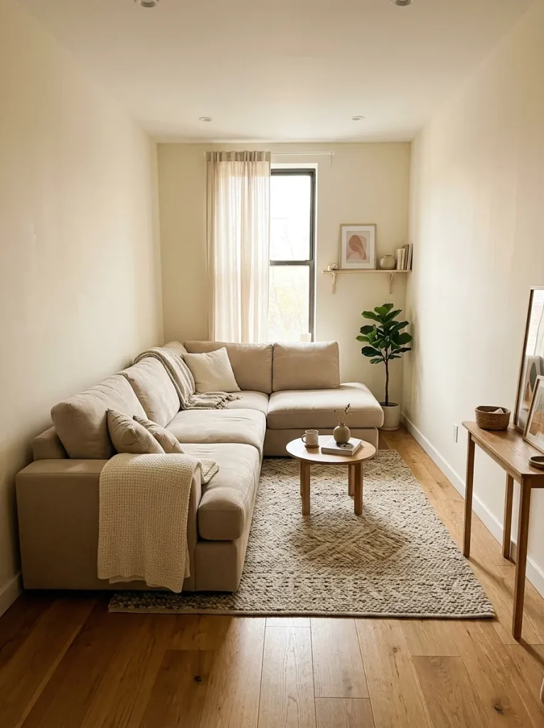
A room can feel awkward before you even know why. Furniture that is too large blocks walking paths, while undersized pieces can leave the space looking disconnected and unfinished. Measure the room and mark furniture footprints with painter’s tape before buying anything.
Aim for comfortable proportions rather than filling every available corner. Leave clear pathways between seating, doors, and major furniture pieces. I’ve noticed that simply replacing one oversized item can make a cramped living room feel considerably more open without changing the entire design.
Blocked Walkways
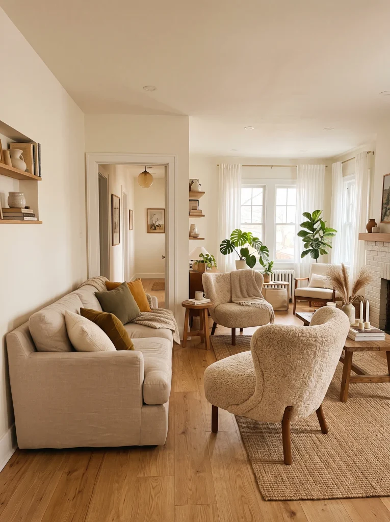
- Keep the main walking route visibly open between the entrance and seating area.
- Leave enough clearance around coffee tables so people can pass without squeezing.
- Avoid placing chairs where they interrupt doors, drawers, or frequently used pathways.
- Check the room from several angles before deciding that furniture placement is finished.
- Keep floor lamps and baskets out of narrow traffic zones.
Furniture placement should support how people actually move through the room. A beautiful chair becomes frustrating when everyone has to walk around it. Before settling on a layout, walk through the space normally and notice where you naturally hesitate, turn sideways, or reach around an obstacle.
Too Many Small Pieces
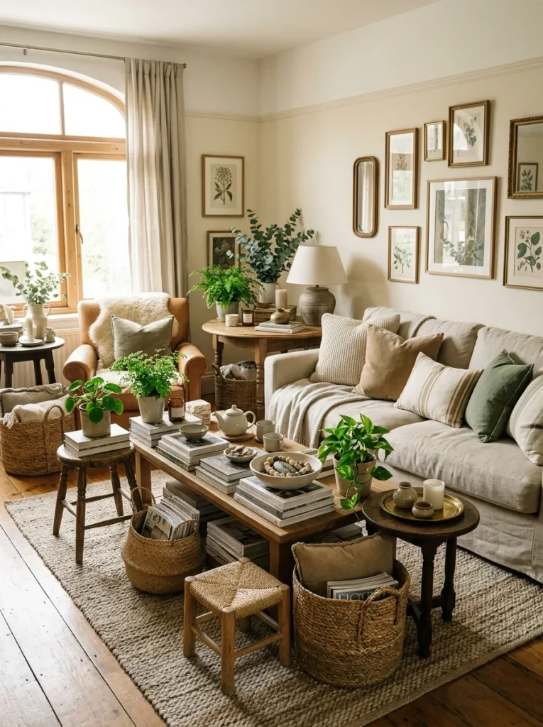
- Group smaller accessories into intentional clusters instead of spreading them everywhere.
- Replace several tiny tables with one substantial side table where practical.
- Keep decorative objects at different heights to create visual hierarchy.
- Remove pieces that serve no useful or decorative purpose.
- Give larger furniture enough surrounding space to remain visually prominent.
Small accessories can quietly create a crowded look, even when the room is technically tidy. Grouping similar items and removing a few unnecessary pieces gives the eye clearer places to rest. In my experience, editing decor is often more effective than buying additional storage or accessories when a living room feels visually unsettled.
Poor Rug Placement
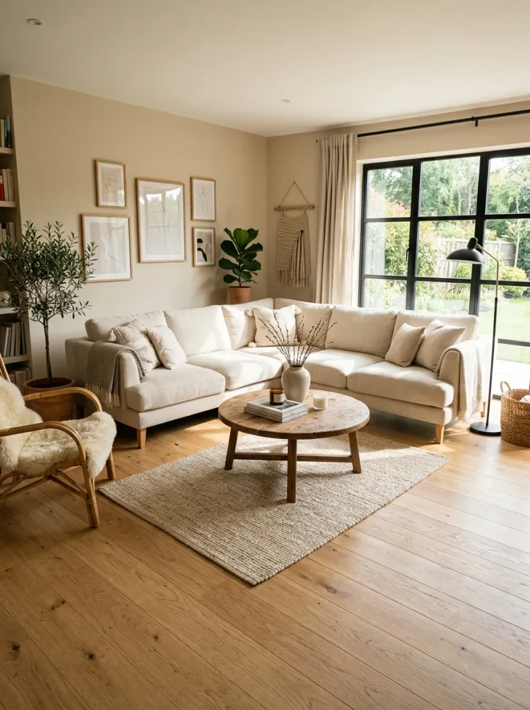
BEFORE: The rug sits too small and isolated in the center of the room. Sofa and chairs feel disconnected from it, while large areas of bare flooring separate each seating piece.
AFTER: The rug extends beneath the front legs of the main seating. The furniture now feels grouped together, creating a clear and comfortable conversation area.
A rug does more than soften the floor. It visually connects furniture and helps define the seating zone. Choose a size that reaches under at least the front legs of your sofa and chairs whenever possible. A properly scaled rug can make scattered furniture feel like one intentional arrangement.
Furniture Against Every Wall
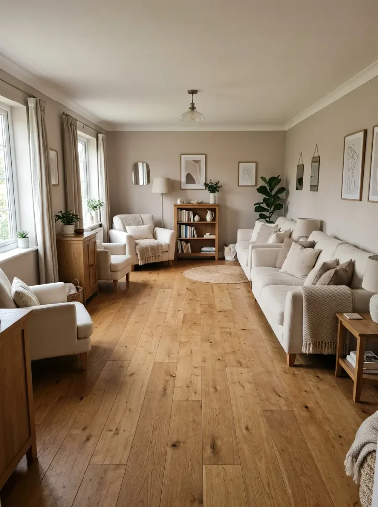
- Pull the sofa several inches away from the wall if the room allows it.
- Bring chairs slightly inward so they face the main seating area rather than the walls.
- Center the coffee table within the seating arrangement.
- Walk around the new layout to check pathways and conversation angles.
- Keep enough clearance behind furniture for cleaning and comfortable movement.
Pushing every piece against the perimeter may seem like the safest choice, but it can leave the center strangely empty. Start by creating a defined seating group instead. Even a small amount of breathing room behind furniture can give the arrangement more depth and make the room feel intentionally designed.
Mismatched Scale
| Comparison | Option A: Uneven Scale | Option B: Balanced Scale |
| Sofa and table | Tiny table beside large sofa | Table sized to seating |
| Lighting | Small lamp beside bulky furniture | Lamp with visual weight |
| Accessories | Many tiny objects | Fewer substantial pieces |
| Overall effect | Disconnected | Cohesive |
A room often feels off when individual pieces compete in size. Large furniture needs accessories and tables with enough visual weight to hold their own. I’ve seen this issue become especially noticeable when a tiny coffee table sits in front of a deep sectional. Better proportions create a calmer, more connected composition.
Overcrowded Surfaces
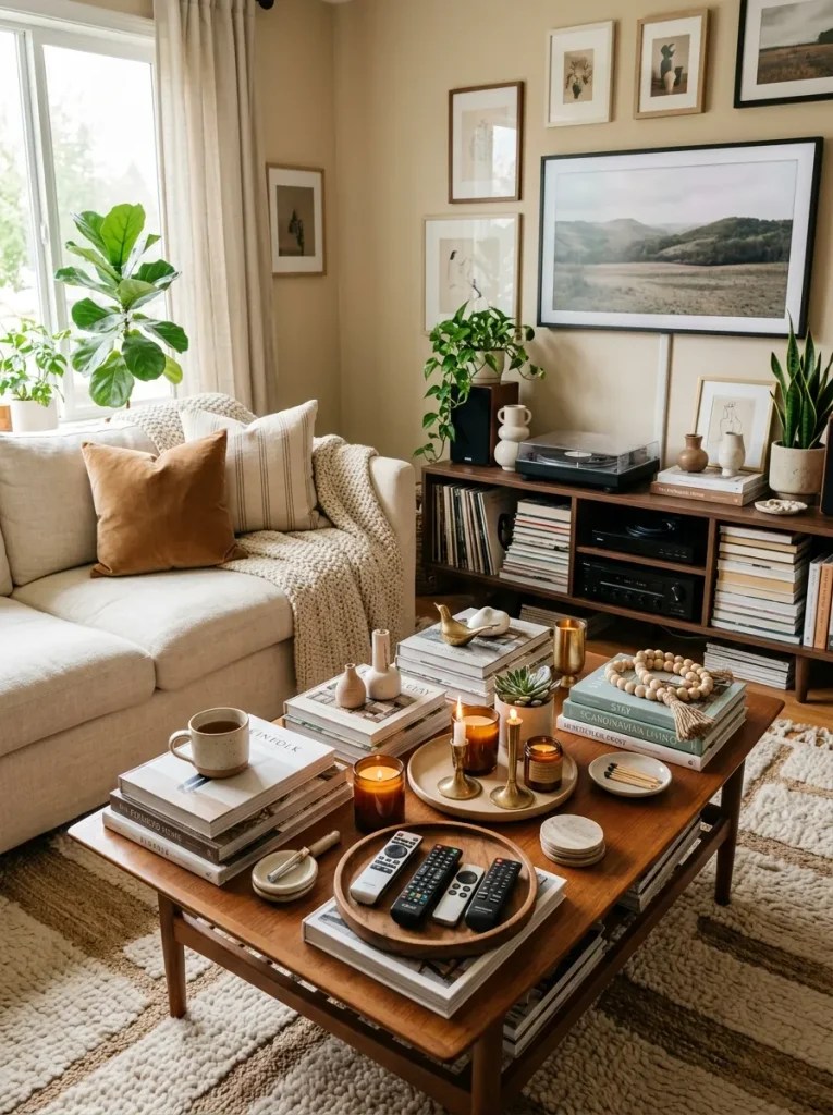
DO
- Keep the coffee table limited to a few useful or decorative pieces.
- Use one tray to group smaller objects neatly.
- Leave visible surface around everyday items for practical use.
- Remove decor that has no clear purpose or connection to the room.
DON’T
- Cover the entire coffee table with accessories.
- Scatter small objects across every available surface.
- Stack items so high they interrupt sightlines.
- Keep decorations simply because there is an empty spot.
Cluttered surfaces can make an otherwise organized living room feel unfinished. Start with the pieces you use every day, then add only a few decorative accents around them. A clear section of tabletop creates visual breathing room and makes both furniture and accessories easier to appreciate.
Ignoring Lighting Layers
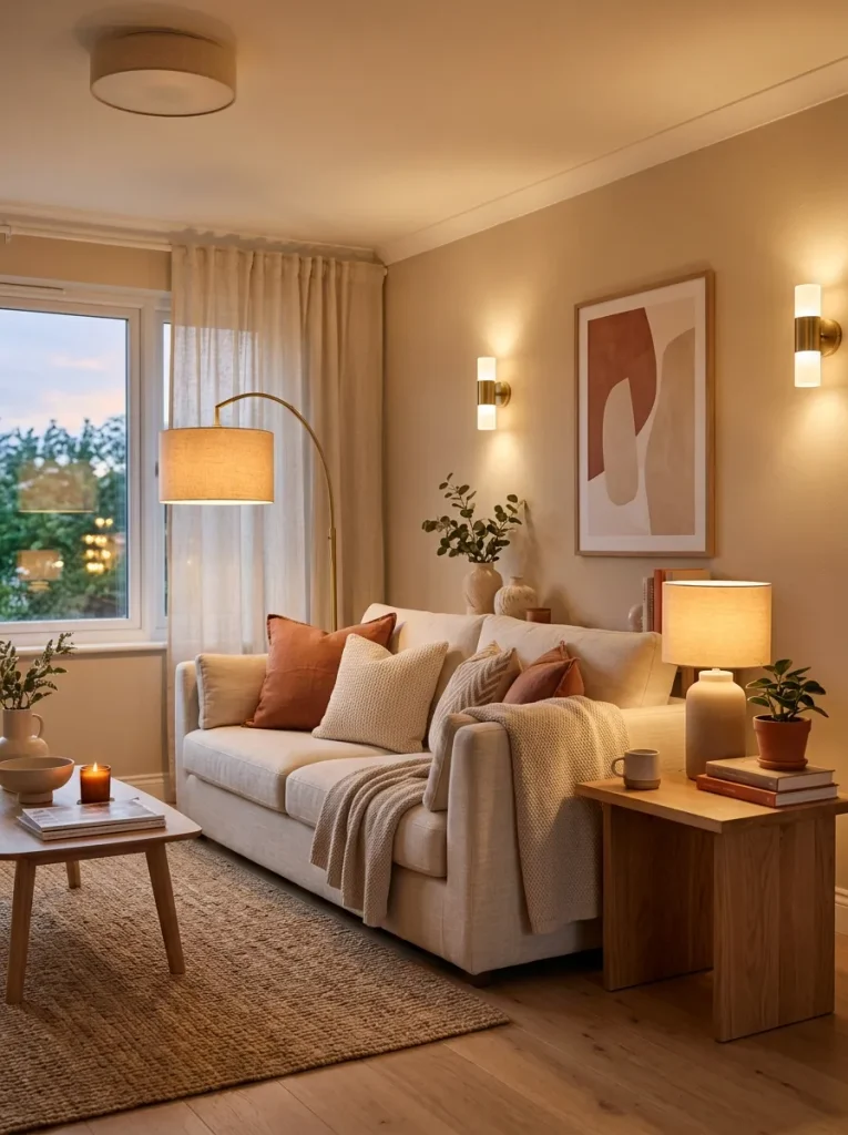
Cost: Low to moderate
Time: One afternoon
Skill Level: Beginner
Best For: Dark corners and evening comfort
Result: Softer, more balanced illumination
A single ceiling light rarely gives a living room the right atmosphere throughout the day. Combine overhead lighting with floor lamps, table lamps, or wall fixtures to spread light at different heights. I’ve noticed that adding one lamp to a dark corner can change the room’s balance without replacing existing furniture or decor.
Oversized Wall Art
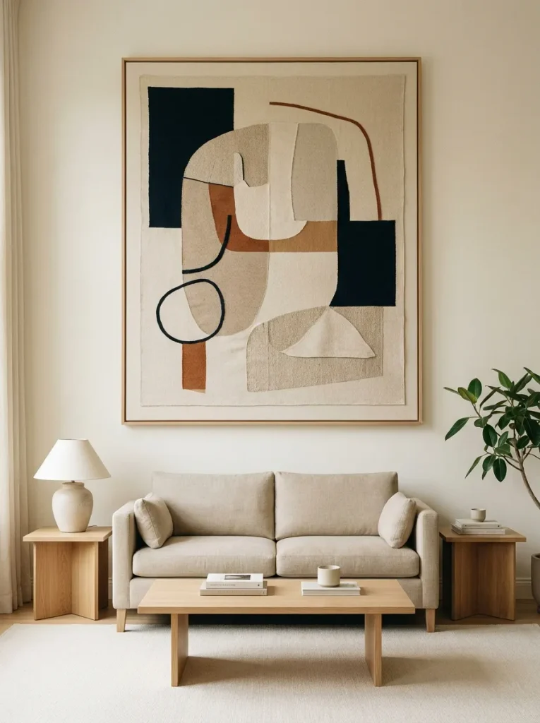
Wall art can dominate a room before the furniture has a chance to establish balance. A common problem is choosing a piece that is too large for the wall or hanging it too high above the sofa. Keep the artwork visually connected to the furniture below, with comfortable spacing rather than excessive empty wall.
Floating Curtain Rods
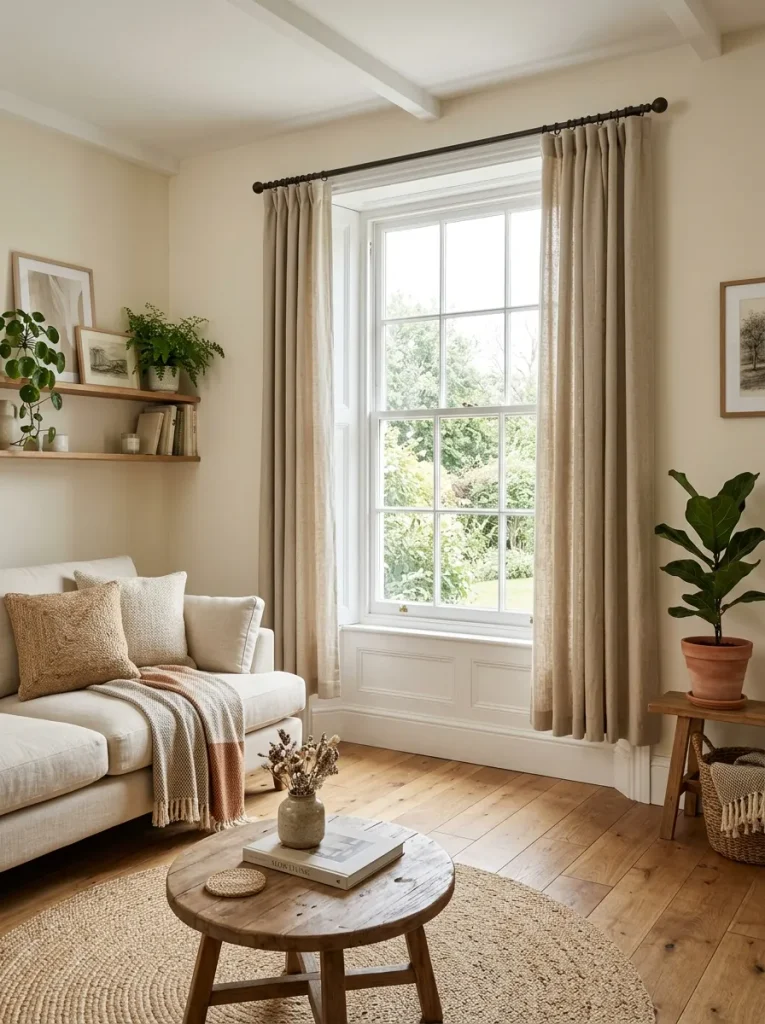
DO
- Mount curtain rods wider than the window frame when possible.
- Position the rod closer to the ceiling for a taller visual line.
- Let panels reach the floor or skim it lightly.
- Choose fabric with enough fullness to create soft, natural folds.
DON’T
- Stop curtains several inches above the floor.
- Mount the rod directly against the window frame without considering wall space.
- Choose panels that barely cover the glass when closed.
- Let uneven hems distract from an otherwise polished room.
Curtains influence the proportions of the entire wall, not just the window. Raising the rod and extending the panels can make ceilings appear taller and windows feel more substantial. Measure carefully before installing hardware, especially in rooms where every inch of wall space contributes to the overall composition.
Matching Everything
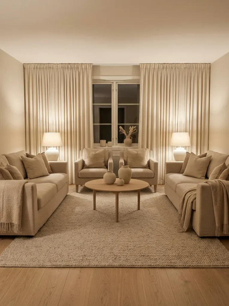
- Keep one or two major pieces within the same color family.
- Introduce a contrasting material such as wood, metal, linen, or woven fiber.
- Mix cushion patterns while keeping a shared color connection.
- Vary furniture shapes instead of choosing identical silhouettes.
- Repeat a few colors throughout the room to maintain cohesion.
A coordinated room does not require every item to come from the same collection. Too much matching can flatten the visual hierarchy and make the space feel staged. Mix related colors, materials, and shapes instead. The goal is connection without duplication, so each piece contributes something distinct to the room.
TV Above Fireplace
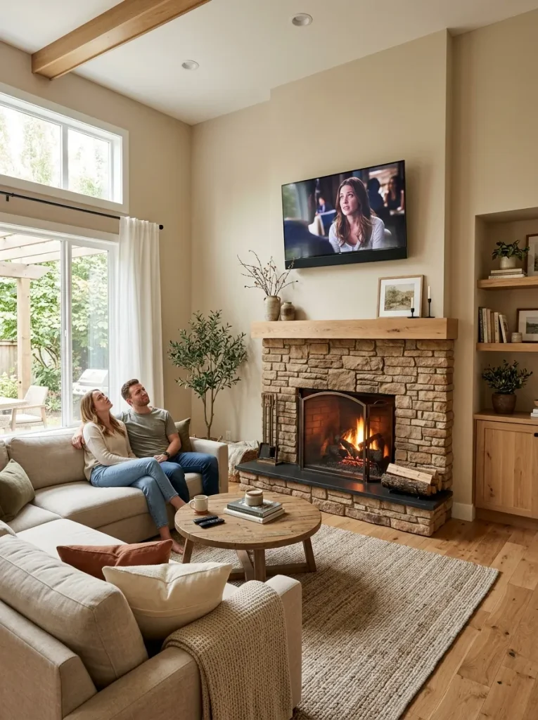
| Comparison | Old Way | Better Way |
| TV height | Positioned very high | Mounted at a comfortable viewing level |
| Fireplace | Dictates television placement | Designed separately when possible |
| Seating | Faces upward toward screen | Faces screen naturally |
| Visual balance | Tall vertical stack | More proportionate arrangement |
A television placed too high can create both visual and practical problems. The fireplace often becomes the reason for this arrangement, but the viewing angle still matters. Consider the room’s primary use before mounting anything permanently. A comfortable sightline should carry more weight than filling the wall above the mantel.
Neglected Focal Point
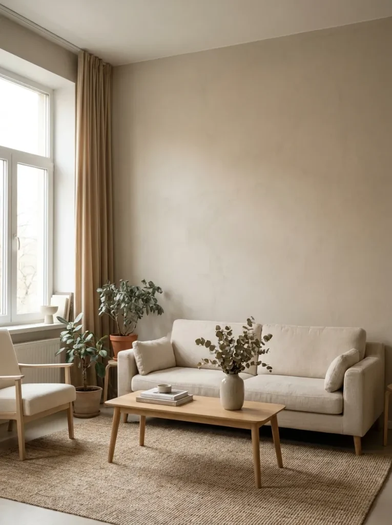
DO
- Choose one main visual anchor for the seating area.
- Build the arrangement around a fireplace, artwork, window, or media console.
- Keep competing statement pieces limited.
- Repeat one or two colors from the focal point elsewhere in the room.
DON’T
- Give every wall equal decorative attention.
- Place several large statement pieces directly beside each other.
- Hide an architectural feature behind oversized furniture.
- Let small accessories compete with the room’s main feature.
A strong focal point gives the eye somewhere to land first. Without one, furniture and decor can feel randomly arranged. In my experience, choosing the focal point before decorating makes later decisions much easier because seating, artwork, lighting, and accessories have a clear visual reference.
Wrong Color Temperature
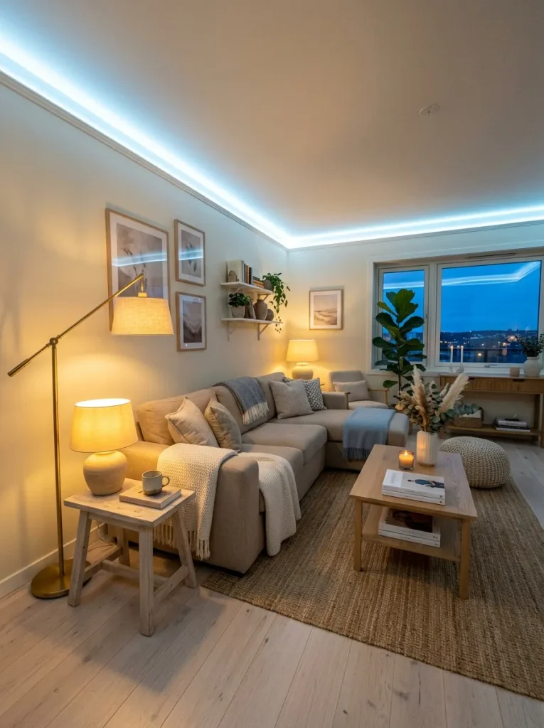
Color Balance: Warm neutrals with one cooler accent
Lighting: Warm white bulbs for evening use
Best For: Rooms with mixed natural and artificial light
Difficulty: Low
Result: More cohesive atmosphere
Lighting color can quietly change how paint, fabrics, and wood finishes appear. Cool bulbs beside warm lamps may make the room feel visually inconsistent, especially after sunset. Choose bulbs with similar color temperatures throughout the main seating area, then check the room again at night before deciding whether the decor itself feels wrong.
Too Much Empty Space
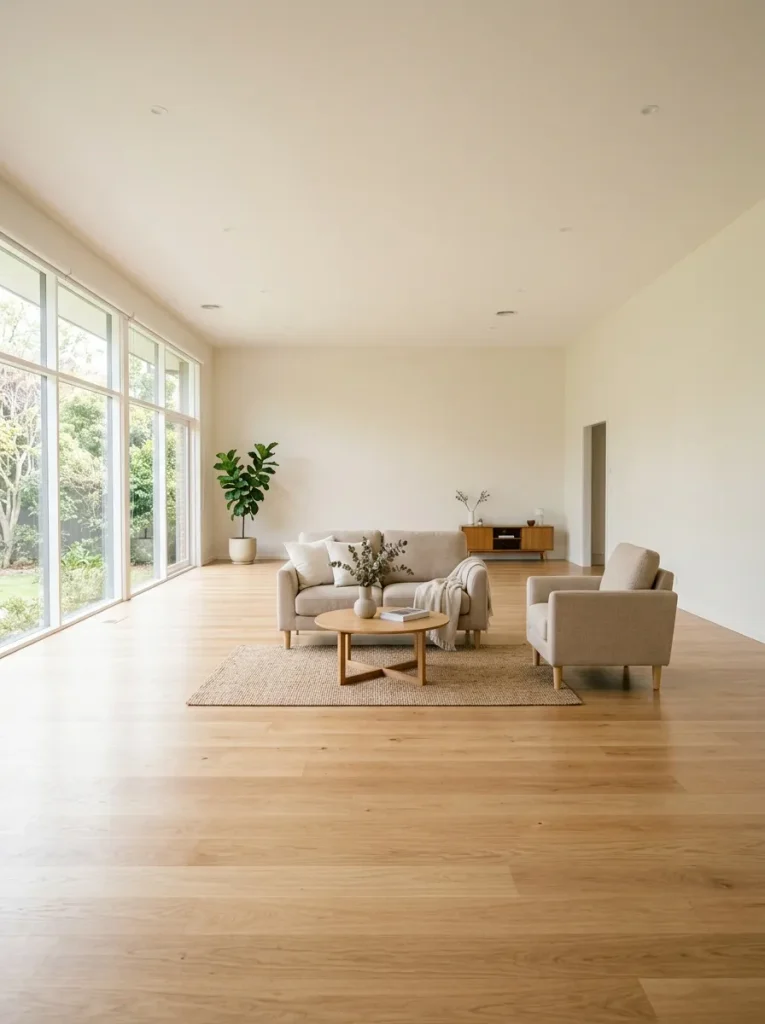
A spacious room can still feel unfinished when furniture occupies only a small island in the middle. This is another reason some living rooms feel disconnected even with attractive pieces. Group seating closer together, add a correctly scaled rug, and use a substantial side table or chair where the layout genuinely needs more visual weight.
Tiny Coffee Tables
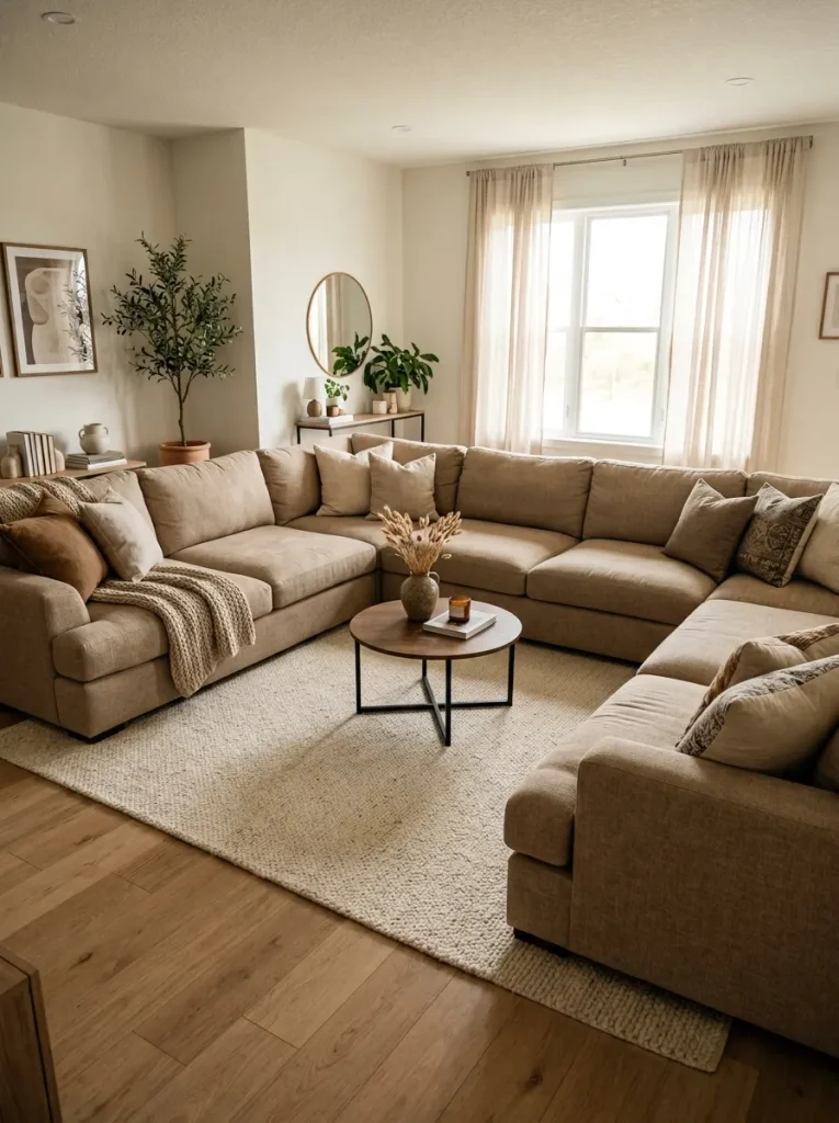
- Measure the sofa depth and seating width before choosing a table.
- Keep the table close enough for comfortable reaching from the sofa.
- Choose a shape that works with the room’s circulation pattern.
- Check that the table has enough surface area for everyday use.
- Leave comfortable walking clearance around the outer edge.
A coffee table should relate to the scale of the seating around it. When it is noticeably too small, the entire arrangement can look scattered. A larger table often creates stronger visual connection between the sofa and chairs while giving you useful space for drinks, books, and everyday living.
Unbalanced Furniture Arrangement
Quick Tip:
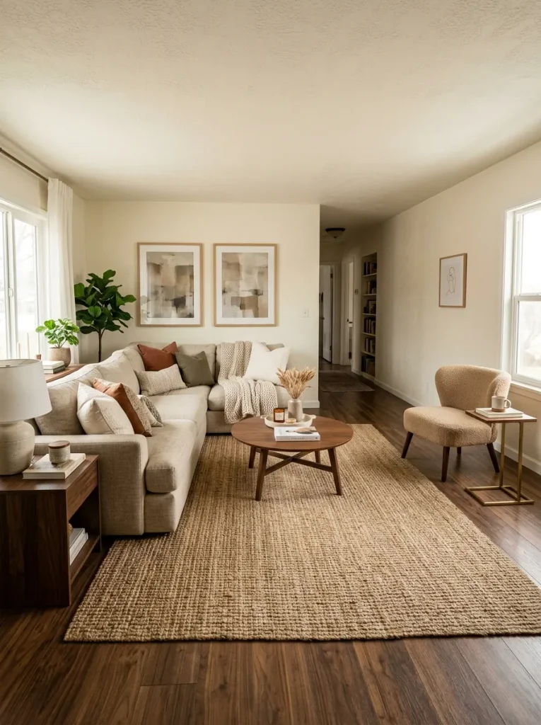
Stand at the main entrance and look across the entire room before moving anything. Notice where the visual weight feels concentrated. Shift a chair, lamp, plant, or side table toward the lighter side rather than automatically buying more furniture.
A balanced layout does not require perfect symmetry. What matters is distributing visual weight across the room. A bulky sectional may need a substantial chair, floor lamp, or larger artwork opposite it. I’ve noticed that balancing height and mass often works better than simply adding more decorative objects.
Ignoring Conversation Distance
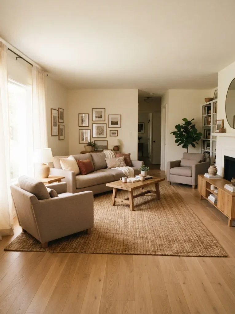
BEFORE: Seating is scattered around the room, forcing people to turn their bodies or raise their voices during conversation. The coffee table sits too far from some chairs.
AFTER: Chairs and sofa face toward one another within a comfortable conversational zone. The coffee table sits centrally, giving everyone easy access without blocking movement.
Furniture should support real interaction, not simply fill floor space. Arrange the main seats so people can comfortably talk without twisting toward one another. A slightly tighter grouping often feels more welcoming and functional than a spread-out arrangement, especially in rooms where entertaining and family time happen regularly.
Clashing Wood Tones
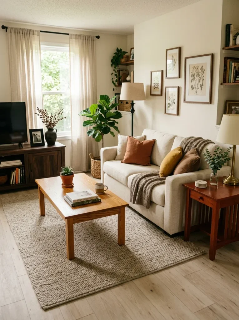
- Choose a dominant tone: Decide whether light, medium, or dark wood will appear most often.
- Repeat one finish: Use the same or closely related wood tone on at least two noticeable pieces.
- Bridge contrasting shades: Add a rug, basket, frame, or textile that contains colors from both wood finishes.
- Check undertones: Compare samples in daylight because yellow, red, and gray undertones can clash.
Different wood finishes can work beautifully, but random combinations may make the room feel visually unsettled. Instead of matching every piece, create a relationship between them. Repeating one finish and connecting contrasting tones through textiles or accessories helps the furniture look intentionally collected rather than accidentally assembled.
Overfilled Sofa
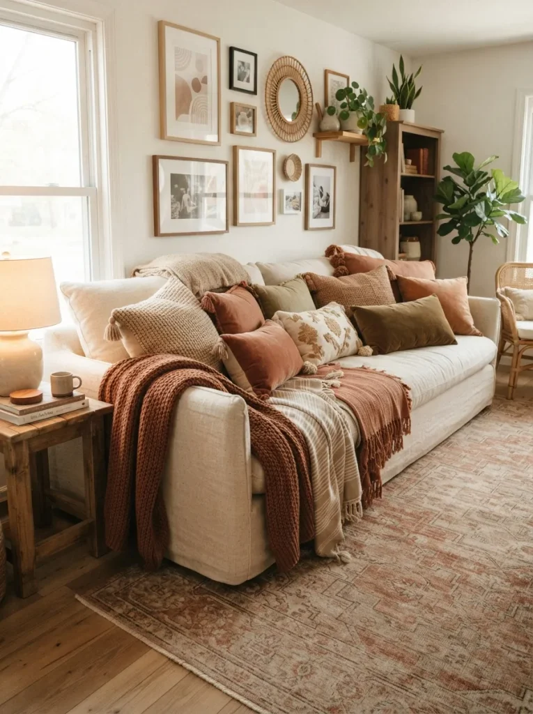
| Comparison | Overfilled Sofa | Better Arrangement |
| Cushions | Many oversized pillows | Fewer varied sizes |
| Seating | Little usable space | Seat remains open |
| Throws | Several bulky layers | One neatly placed throw |
| Visual effect | Heavy and crowded | Soft and balanced |
A sofa should look inviting without becoming buried beneath accessories. Start with the number of seats available, then add cushions that support rather than occupy them. A simple mix of two or three sizes can provide texture while preserving usable space. Keep one section relatively clear for sitting, relaxing, and everyday comfort.
Also View 21 Colorful Living Room Ideas for a Vibrant Refresh
Random Decor Placement
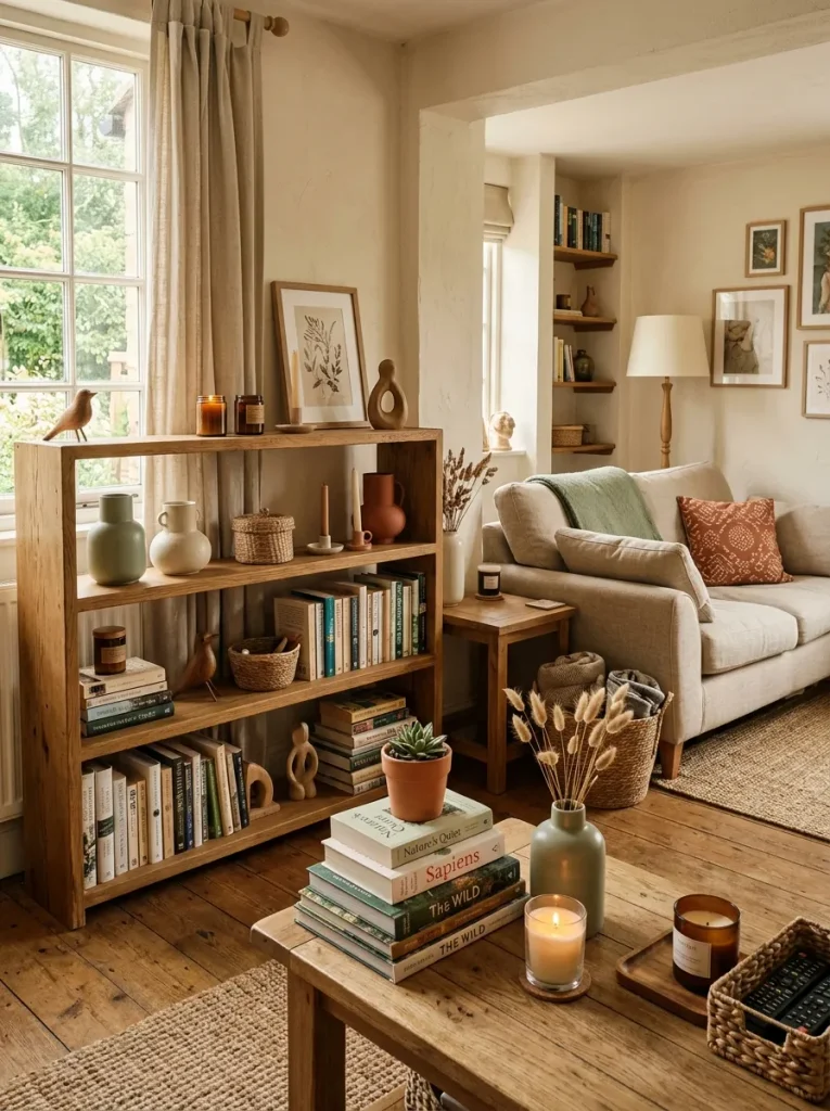
DO
- Group objects by color, material, or purpose.
- Vary heights within each decorative cluster.
- Leave small areas of empty space between groups.
- Repeat important accent colors in at least two locations.
DON’T
- Scatter single objects evenly across every surface.
- Fill every shelf from edge to edge.
- Mix too many unrelated colors in one small area.
- Add accessories simply because a surface looks empty.
Decor feels more intentional when objects have a visual relationship. Grouping three related pieces on a tray can look stronger than placing those same pieces far apart. I’ve seen simple editing improve a room quickly: remove a few unrelated items, then arrange what remains into small, purposeful clusters with breathing room around them.
CONCLUSION
A living room does not need to be expensive or perfectly styled to feel good. The right proportions, clear pathways, balanced furniture, thoughtful lighting, and edited decor can make a noticeable difference.
If you’ve been wondering why your room feels slightly off, start with one mistake from this guide and make a small adjustment. I’ve seen how simple changes like these can completely shift the way a space feels. Save this post on Pinterest so you can revisit these ideas during your next decorating project, and share it with someone who could use a little living room inspiration. Your best room may be closer than you think.