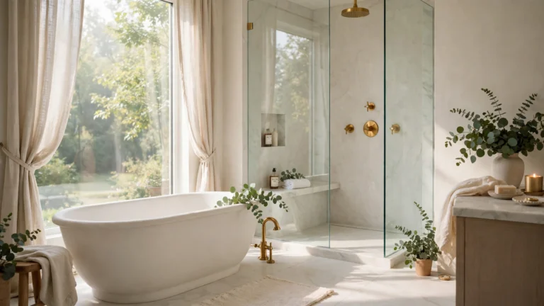
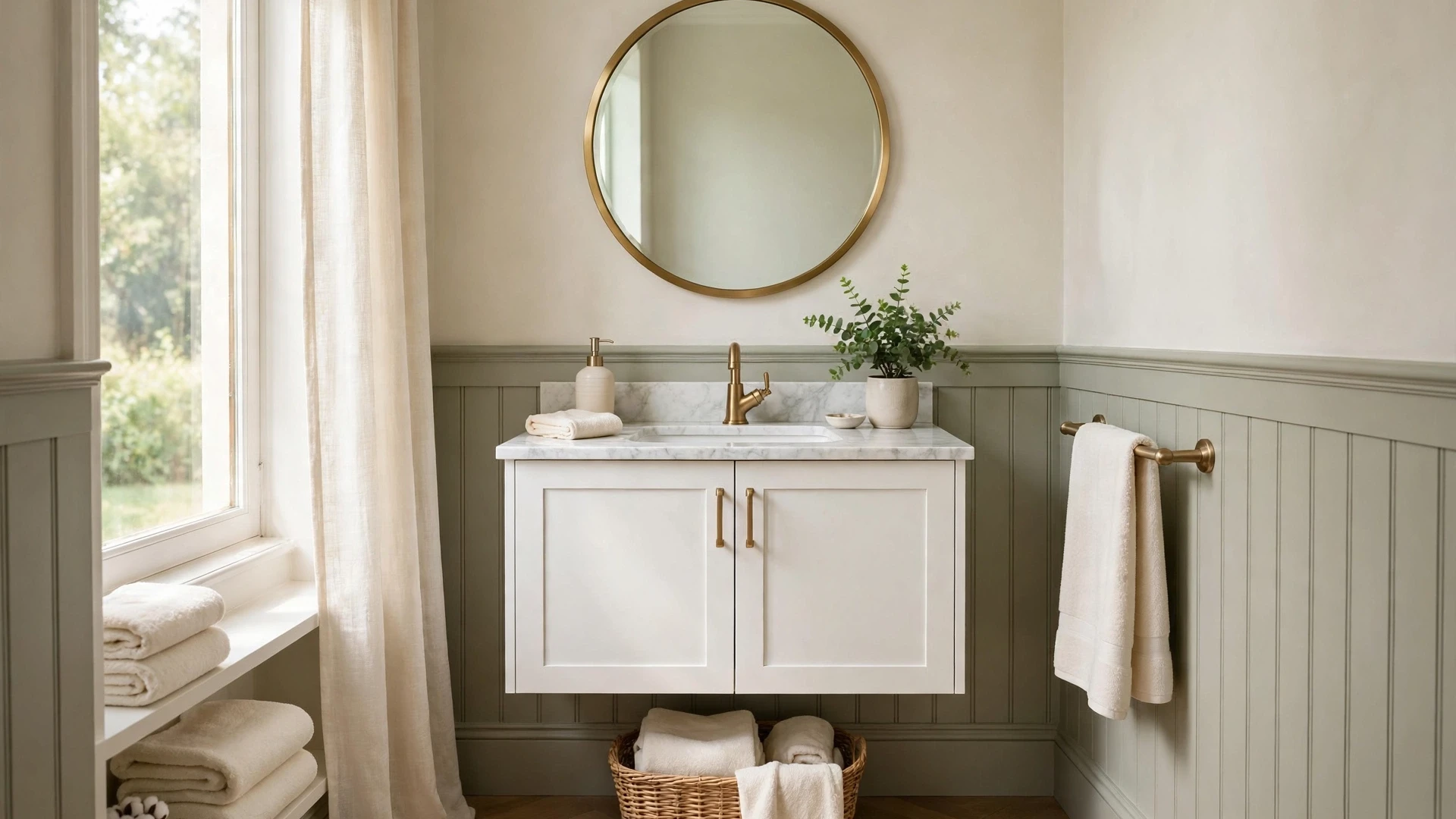
24 Refined Small Bathroom Color Ideas Beyond Beige
Finding small bathroom color ideas for a more polished look can feel tricky when every shade seems either too stark or too dull. The right palette gives even the smallest room a calm and finished feel without a full remodel.
This collection covers soft whites, warm greys, deep greens, inky blues, and muted blush tones, each paired with simple finish and lighting notes. I learned while redoing my own tiny ensuite that testing two large swatches first saved me from a costly repaint. These ideas suit renters, first time renovators, and anyone working with limited natural light who still wants a bathroom that feels tidy, layered, and quietly luxurious every single day without chasing trends or overspending on tiles and fixtures alone, which makes planning much less stressful overall in the end.
Soft Ivory White
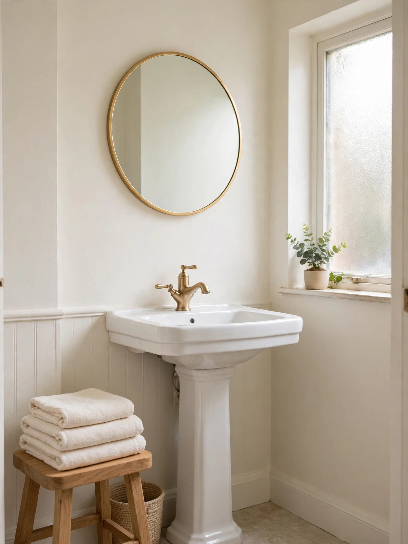
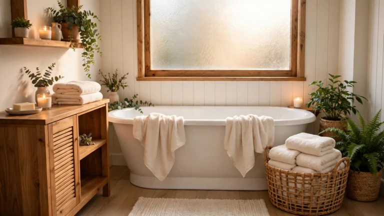
Soft ivory keeps a tiny bathroom bright without the cold edge of pure white. It reflects daylight gently and makes old tiles look fresher beside it. Pair it with warm wood or brass so the room feels finished rather than plain and flat.
Use the same ivory on walls and ceiling to soften corners and lift the ceiling line. Add texture through towels, a woven basket, and a simple framed print. This approach suits north facing rooms where warm light matters most on grey mornings and evenings all year round without fail.
Warm Greige Walls

- Paint all walls in a warm mid greige with soft depth
- Keep the vanity, basin, and bath panel in crisp clean white
- Add brushed bronze taps, handles, and mirror frame for quiet contrast
- Layer cream towels, light wood stools, and a small woven basket
Greige sits between grey and beige but feels warmer and more current than either alone. In a small room it hides everyday marks quite well and pairs with both chrome and brass. Test it near your mirror first, since artificial light can push it cooler at night.
Pale Stone Grey

Quick Tip: Paint the ceiling the same stone grey to soften harsh corner shadows in a low room.
Pale stone grey gives a small bathroom a calm, hotel like background without feeling cold. It works well with white sanitaryware and chrome, and it shows less dust than bright white. Choose a washable finish for the splash zone and keep grout pale so the walls and floor read as one quiet surface. Add one dark accessory, such as a black frame, to give the soft palette a clear edge and focus.
Deep Forest Green

BEFORE: Plain white walls felt stark and the small bath area looked unfinished and cold each morning.
AFTER: Deep green on all walls wrapped the room in colour and made the white bath look bright and sculptural again beside warm brass.
A deep green can make a tiny room feel intentional rather than small. Keep the ceiling pale, add warm light bulbs, and repeat brass in two or three places so the scheme feels planned. Large tiles or no tiles on the green walls keeps the look smooth and very calm.
Inky Navy Blue

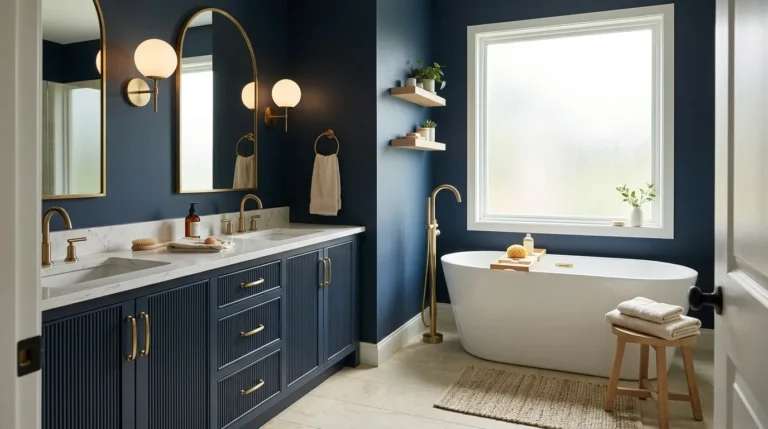
- Paint walls in inky navy with a soft sheen finish
- Fit a large mirror to bounce light around the room
- Choose white vanity and towels for strong clean contrast
- Add gold or brass details in taps and frames
For small bathroom color ideas for a more polished look, navy is a reliable deep tone that feels smart without reading as black. It suits classic and modern schemes alike. Keep the floor light and add a pale rug so the room stays balanced and welcoming for guests daily and family too, always.
Charcoal Slate Accent
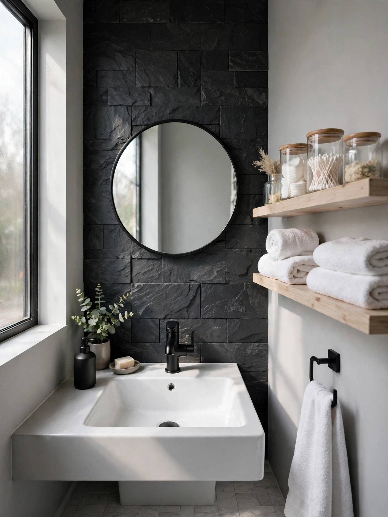
| Element | Choice |
| Walls | Light warm grey |
| Accent | Charcoal slate paint |
| Metal | Matte black |
Using charcoal on one wall only gives depth without darkening the whole room. The accent works best behind the basin or bath, where the mirror and fittings sit. Keep the other walls pale and repeat the charcoal tone in a soap dish, frame, or towel edge so it looks deliberate. Slate inspired paint with a flat finish hides minor wall flaws well, which helps older bathrooms. Add warm bulbs, since cool light can make charcoal feel harsh in the evening hours.
Muted Sage Green

DO:
- Pair sage with warm white and light wood tones
- Use plants or leaf prints to echo the colour
DON’T:
- Mix sage with bright yellow towels or mats
- Paint sage over glossy tiles without proper prep
Sage brings outdoor calm indoors and feels softer than grey while staying neutral enough for daily use. It flatters most skin tones in mirrors, which makes morning routines pleasanter. Choose a muted version with grey in it, since bright sage can look minty under bathroom lights and date quickly in photos and in real life too.
Dusty Blush Pink
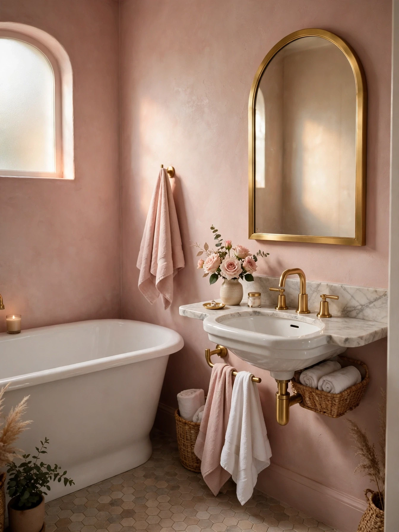
Cost: Low to medium for paint and towels
Time: One weekend for two coats
Skill Level: Beginner friendly with careful taping
Best For: Dull rooms needing warmth
Dusty blush adds warmth without the sweetness of bright pink. The dusty base keeps it grown up and easy to live with. Pair it with white marble and gold for a hotel feel, or with pale grey for a quieter look. Keep patterns small, since large prints can fight the soft colour. A single green plant gives useful contrast and stops the scheme from feeling too matched.
Creamy Alabaster Glow
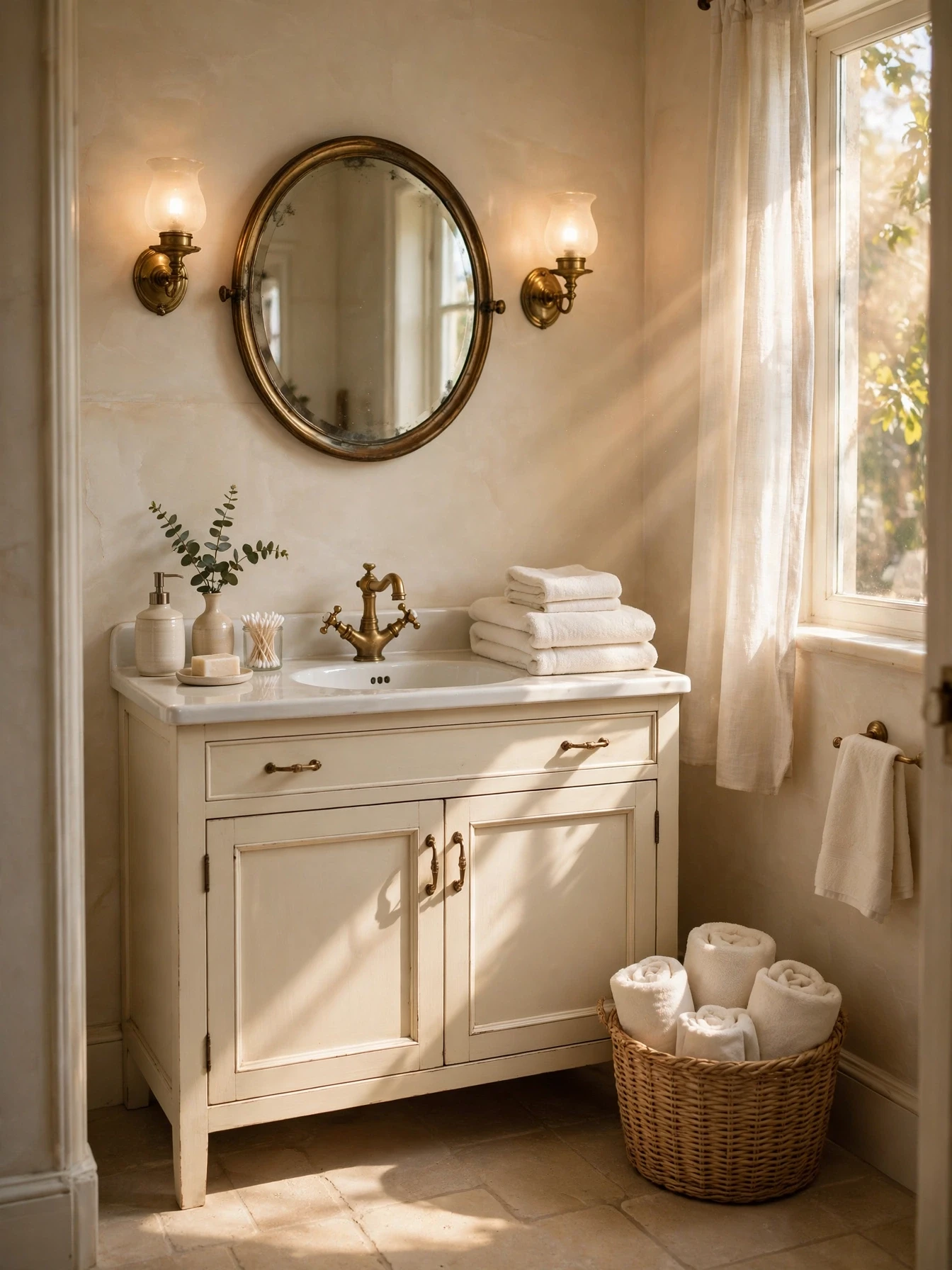
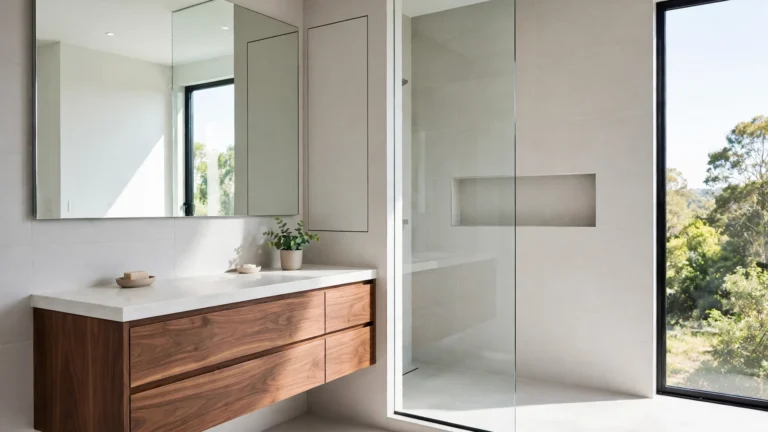
Alabaster is a creamy off white with a hint of warmth that glows under soft bulbs. In a small room it feels cosy yet bright through the day. It suits traditional fittings and older homes where stark white can look out of place.
Layer alabaster with slightly deeper cream on woodwork to create gentle contrast without harsh lines. Add stone or travertine accessories for texture. Keep chrome or brass consistent across taps, handles, and lights so the soft palette stays tidy and calm from every angle daily and always looks neat.
Smoky Blue Grey

- Choose a smoky blue grey with balanced undertones throughout
- Keep large surfaces white to hold the light well
- Add silver or chrome fittings for a clean finish daily
- Use white and mid grey towels in neat layers
- Include one navy item for depth and quiet contrast
Smoky blue grey feels calm like a coastal morning but works in town homes too. It gives a restful background for white fittings and hides splashes well. Avoid very blue versions in low light, since they can feel cold. A warm white ceiling keeps the balance right.
Rich Burgundy Touch
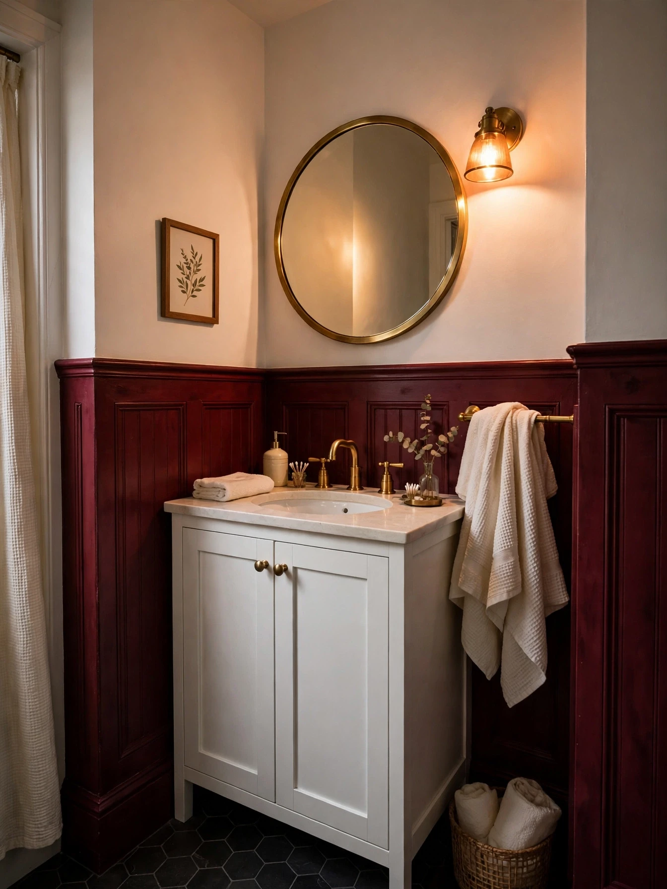
Quick Tip: Use burgundy below dado height only to keep the room feeling open and light above.
Burgundy brings richness that suits period homes and newer flats alike when used in a measured way. Half height colour with warm white above gives drama without shrinking the room. Brass and cream soften the depth, while a dark floor grounds the scheme. Test the shade in daylight and lamplight, since burgundy can shift toward brown or purple. Keep clutter hidden, because strong colour looks best against clear and tidy surfaces every day.
Classic Black And White
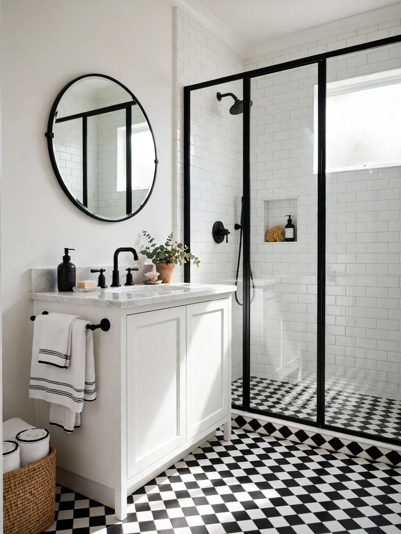
BEFORE: All white tiles and fittings blended together and the room felt flat with no clear focal point at all.
AFTER: A black floor, black taps, and a framed mirror gave the white base sharp definition and lasting style throughout.
Black and white stays current because the contrast is clear and easy to update with towels or art. Keep the split roughly seventy percent white to thirty percent black in a small room. Small checker or hexagon floors add pattern without needing coloured walls or extra decor pieces at any time.
Warm Taupe Neutral

- Paint walls in warm taupe with a washable soft finish
- Match grout closely to tiles for a smooth calm effect
- Add cream textiles and light stone accessories for layering
- Fit warm bulbs to keep taupe golden not grey
Taupe offers more depth than cream while staying calm and easy to pair. It works as a gentle bridge between warm and cool fittings in mixed homes. Keep one element clearly lighter and one slightly darker than the walls so the room has shape and does not fade into a single flat tone at night.
Olive Green Calm

| Element | Choice |
| Walls | Soft olive paint |
| Wood | Light oak |
| Metal | Brushed brass |
Olive feels earthy and calm, sitting between green and brown in a way that suits wood and stone well. In low light it deepens, so keep towels and the ceiling pale for contrast. The colour hides small splashes and marks better than pale neutrals, which helps busy family rooms. Add black in tiny doses, such as a frame or soap pump, to sharpen the soft edges. Avoid lime accessories, since they can make olive look dull by comparison in daylight.
Powder Blue Serenity

DO:
- Pair powder blue with crisp white and silver fittings
- Add clear glass storage to keep surfaces feeling light
DON’T:
- Use dark navy towels across every surface daily
- Add busy floral patterns in competing bright colours
Powder blue feels fresh and clean without the chill of a deeper blue. It reflects light well and gives white fittings a soft outline against the wall. Keep the shade slightly greyed for a grown up result. Pure baby blue can feel young in a main bathroom, while a greyed version reads calm and stays easy to match with chrome and white tiles over time.
Plum And Brass

Cost: Medium for vanity paint and brass fittings
Time: One weekend for prep and painting
Skill Level: Confident beginner with sanding patience
Best For: Plain rooms needing character
Painting only the vanity in plum gives rich colour without darkening every wall. Brass warms the purple base and makes it feel planned and quite luxurious beside marble. Keep walls warm white and towels cream so the vanity stays the focus. This idea suits a plain room that needs character fast. Repeat plum once more in a small stool or framed print to link the scheme, but keep the repeat small and neat.
Terracotta Clay Warmth
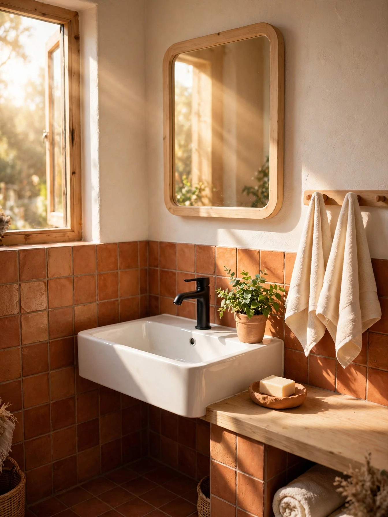
Terracotta brings sun warmed colour to a small bathroom and pairs well with white and wood. Used on lower tiles or one wall, it adds warmth without glare in bright rooms. Keep the upper walls pale to hold the light.
Black fittings sharpen the earthy tone, while cream towels soften it for daily use. Add a plant with deep green leaves for contrast. Choose matt finishes over glossy versions here, since matt clay looks more natural and hides water spots better between regular cleans each week and busy family mornings too.
Pearl Grey Shine

- Choose pearl grey paint with a subtle soft sheen finish that lasts
- Keep marble or pale tiles to reflect light gently around
- Use chrome fittings and clear glass for extra sparkle daily
- Add white towels with a fine silver grey border detail
Among small bathroom color ideas for a more polished look, pearl grey stands out for rooms with poor light that need help. Its slight sheen bounces light very softly around mirrors and tiles. Keep patterns minimal so the shine stays the main detail and the room feels restful.
Teal Depth Accent

Quick Tip: Limit teal to one wall and keep the rest warm white for balance in small rooms.
Teal sits between blue and green and feels fresh without being loud when the shade is deep. It pairs well with brass and warm white, and it makes white baths look crisp. Use it where light hits it during the day, since teal in a dark corner can read almost black. Keep accessories plain and let the single wall carry the colour story for the whole compact room each day without extra fuss.
Lavender Grey Softness
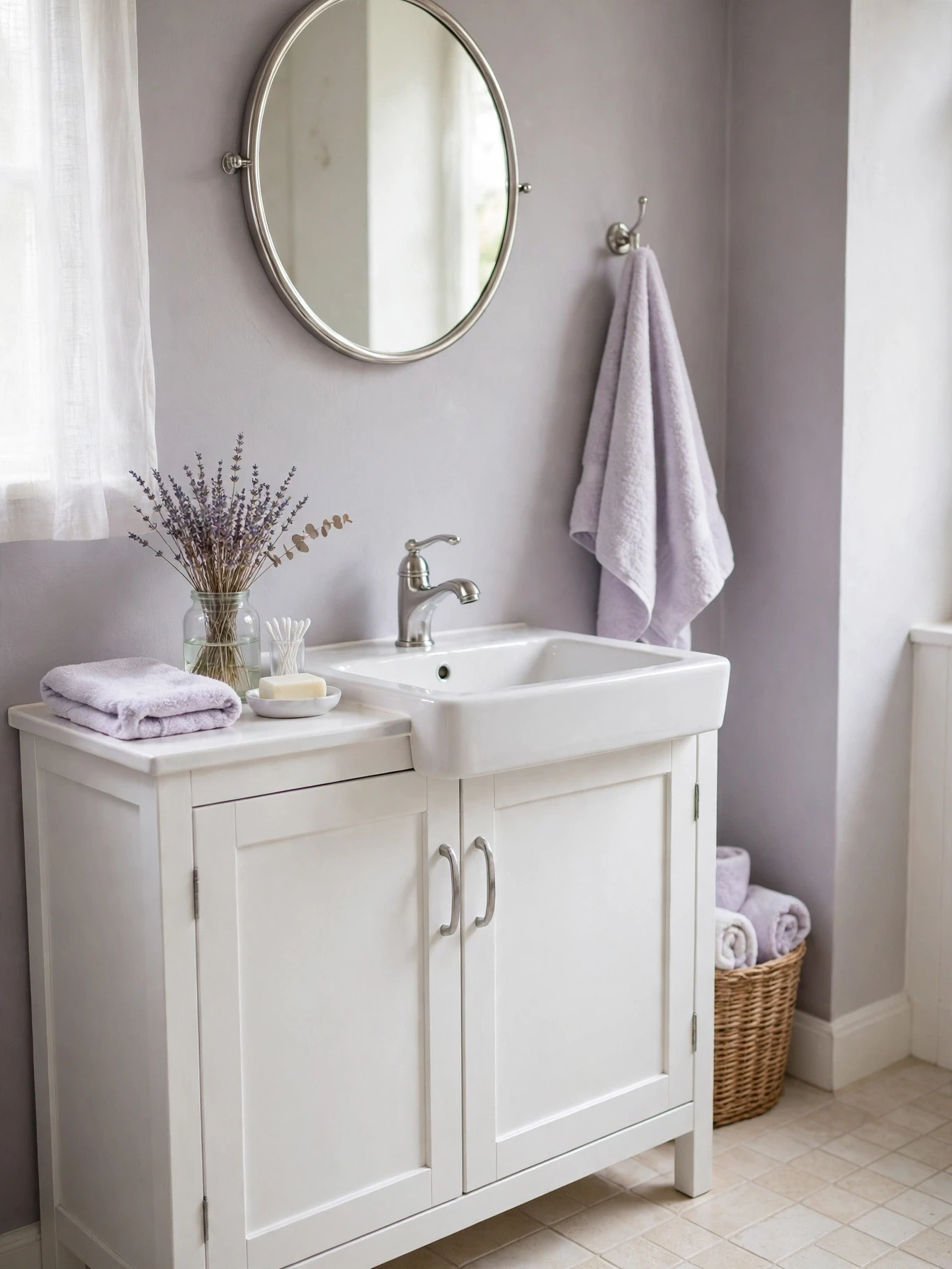
BEFORE: Cold grey walls felt dull and the small room lacked any softness for relaxing evening baths at home.
AFTER: Lavender grey added a gentle tint that made white fittings look softer and more welcoming in the same light.
The grey base keeps lavender calm and suitable for a main bathroom, not just a guest space. Silver and white keep it fresh, while a touch of deeper purple in one towel adds depth. Keep the shade pale in low light rooms, since lavender grey darkens more than expected once dry on the wall.
Sandstone Cream Layers

- Paint walls in sandstone cream with a flat calm finish
- Layer cream tiles and pale stone for gentle tonal depth
- Add light wood and woven textures for natural warmth daily
- Keep towels in cream and white stripes only throughout
Sandstone cream builds a layered neutral look with more depth than a single cream paint. The key is varying texture not colour across tiles, towels, and wood. Keep each layer close in tone so the room feels calm. This works well in windowless rooms with warm bulbs fitted throughout the space.
Midnight Green Vanity

| Element | Choice |
| Vanity | Midnight green paint |
| Walls | Warm white |
| Counter | White marble |
A midnight green vanity gives a white bathroom a strong centre without painting every wall dark. The deep tone looks rich beside white marble and brass, and it hides fingerprints better than white doors. Keep walls and towels pale so the vanity stands out cleanly. Use a washable satin finish for easy wiping. This is a good weekend project, since only the vanity changes while plumbing and tiles stay in place for daily use and guests notice it.
Blush And Marble
DO:
- Pair blush with real or effect marble surfaces
- Use gold sparingly on taps, mirror, and lights
DON’T:
- Cover every wall in strong pink paint shades
- Add glitter accessories that cheapen the soft look
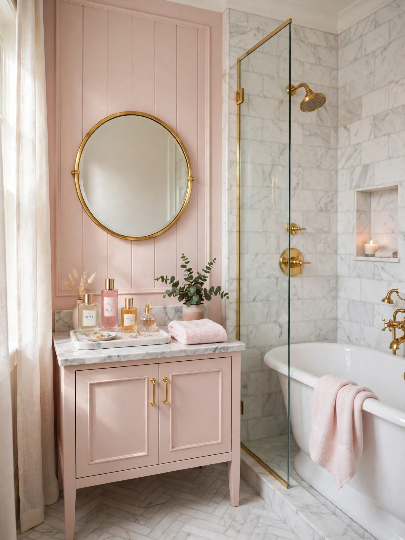
Blush and marble is a classic pairing that feels refined when the pink stays dusty and the marble veining stays soft. Keep gold details small and neat so they read as accents, not decoration overload. White baths and basins keep the scheme fresh. Choose one blush focus, either walls or towels, rather than both at full strength in a tiny room.
Graphite And Chrome
Cost: Low for cabinet paint and chrome handles
Time: One weekend including drying between coats
Skill Level: Beginner friendly with careful masking
Best For: Modern flats and rentals
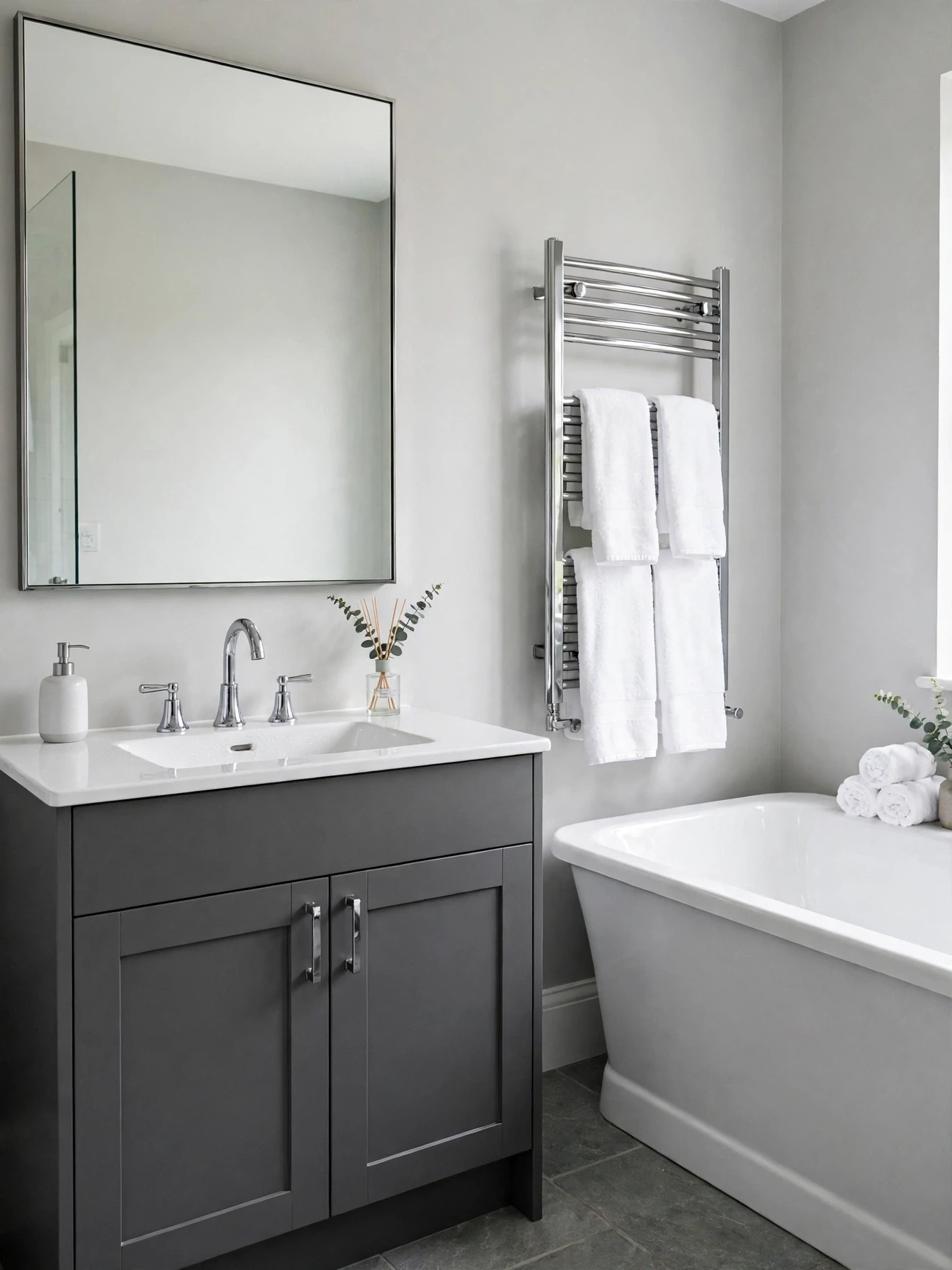
Graphite cabinets ground a light bathroom and give it a modern edge without dark walls. Chrome keeps the look crisp and slightly tailored beside white and grey. Keep walls light and the mirror large so the dark base does not shrink the room. Wipe cabinets with a soft cloth, since dark paint shows dust sooner than pale colours. Pair with plain white towels for the cleanest finish each day.
Conclusion
The best small bathroom color ideas for a more polished look rely on restraint, good light, and balance rather than many competing shades at once. Whether you chose a soft neutral or a deeper tone, keeping finishes consistent helps a small room feel complete, calm, and considered.
In my own bathroom, a single paint change made morning routines feel calmer than any new accessory did. Pick your favourite palette from this list today and order two sample pots to test this weekend. If this guide helped, save it on Pinterest and share it with a friend planning a small bathroom refresh soon at home together.